CareBOT
Form, colour and trust in a hospital delivery robot
CareBOT is a hospital delivery robot in development by HAN to move medication, blood samples and bedding through hospital corridors, easing pressure on staff. The robot is still in its early chassis phase, so this project focused purely on its exterior: the form and colour needed to make it come across as trustworthy, approachable and professional before any interaction even starts.
- 20 weeks, 2026
- Form & colour research, concept development, testing
- Sketching, Photoshop, AI-assisted visualisation
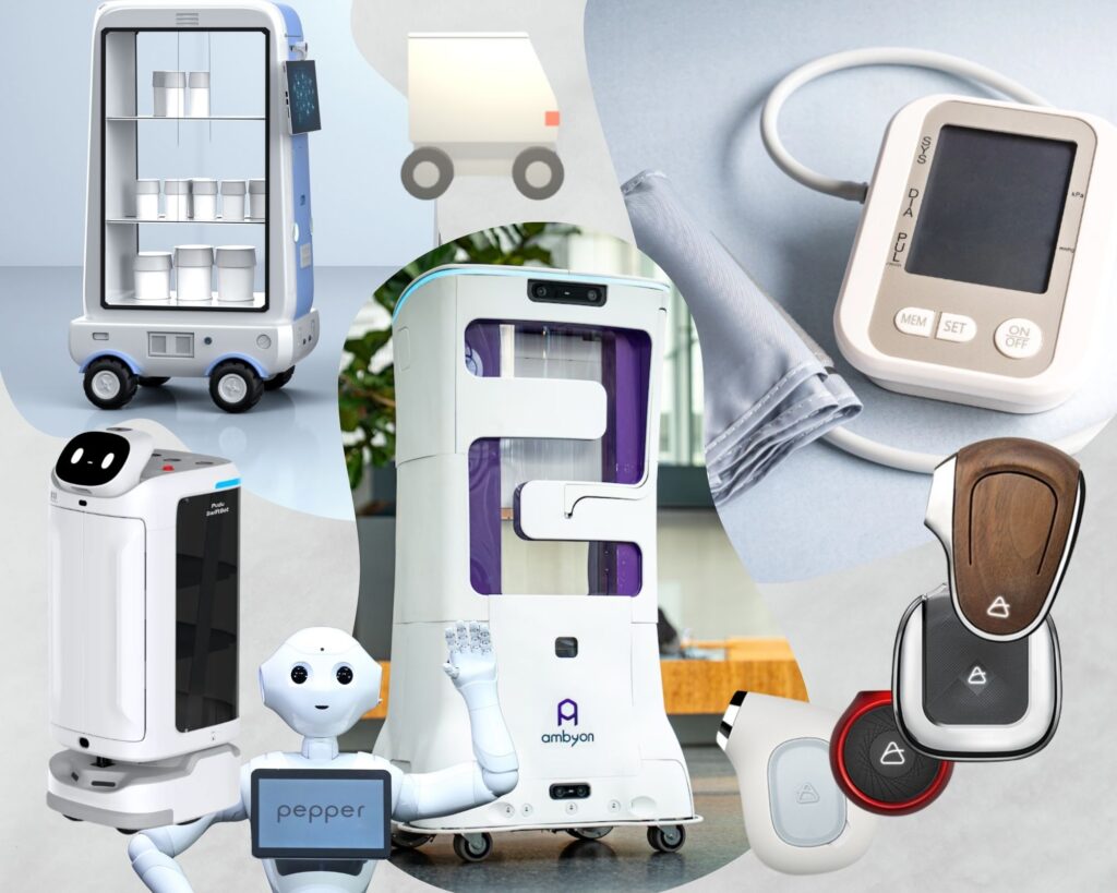
The challenge
How can form and colour contribute to a trustworthy and friendly hospital delivery robot?
Rising workloads in healthcare are the reason CareBOT exists at all: taking transport tasks off staff so they can focus on care. But a robot only helps if people actually trust it. Interaction design was out of scope for this project, since a separate team owns that, so the question became purely visual: what does a robot’s shell need to look like to read as trustworthy, approachable and professional to hospital staff, without ever saying so?
Research & understanding
Trust
Form Guides Function: a clear, professional shape doesn’t just serve its purpose, it actively signals safety and precision, guiding how people intuitively interact with it using affordances and signifiers.
Colour
White and blue dominate hospitals for calm, trust and hygiene, and for making dirt and blood easier to spot, though soft, low-saturation warm tones could work to increase the approachability.
Form
Rounded forms and slanted fronts read as safer, friendlier and more predictable than sharp edges, which feel cold and risky, while a fully rectangular volume comes across as boxy and unsettling.
These findings shaped three guiding principles for the design: trustworthy, professional and approachable.
Exploration & process
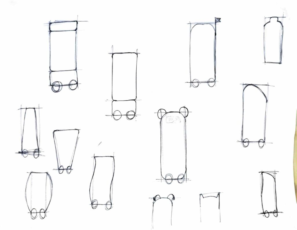
Ideation sketches
After sketching a wide range of silhouettes, a slanted, rounded front won out, since it reads as predictable and makes the screen and drawers instantly recognisable as the interaction zone.
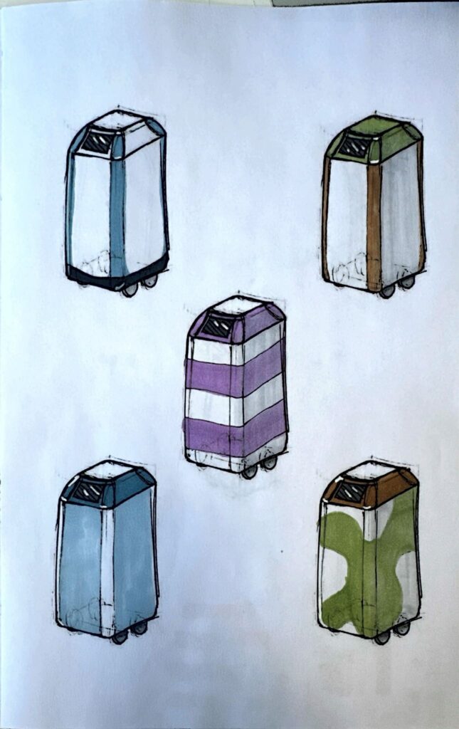
Colour & detail testing
Four shapes were printed and coloured in multiple passes to test colours. White space read as calm and hygienic, low-saturation tones outperformed bright ones, and feedback from fellow students led to numbered drawers and integrated parting lines.
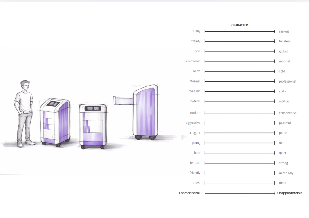
Three concepts & testing
Three visually comparable concepts (a reserved lined form, mailbox-shaped one and a more recycled plastic patterned one) were tested with 8 participants, split evenly between hospital staff and people without a care background.
Concept 1
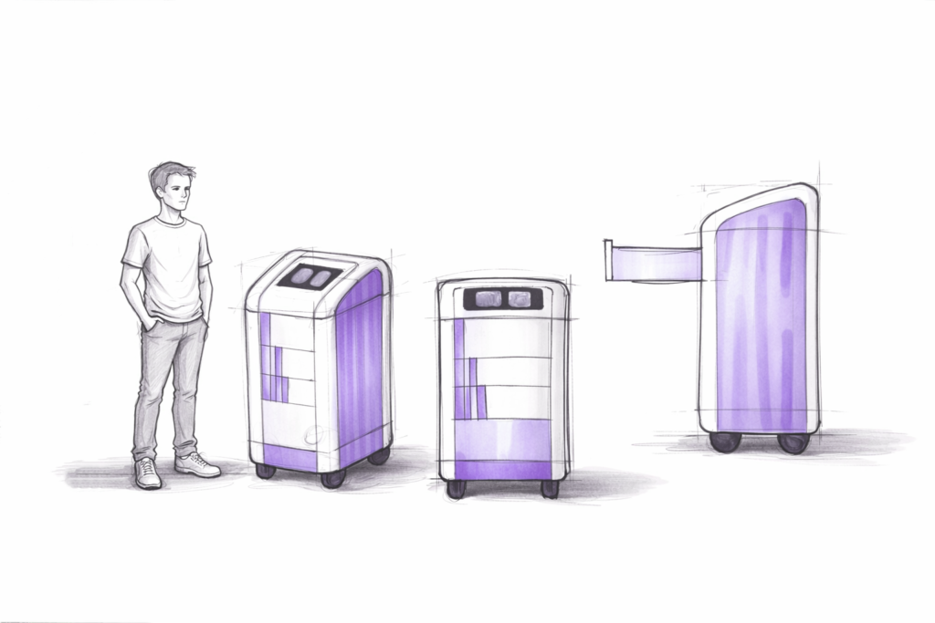
Concept 2
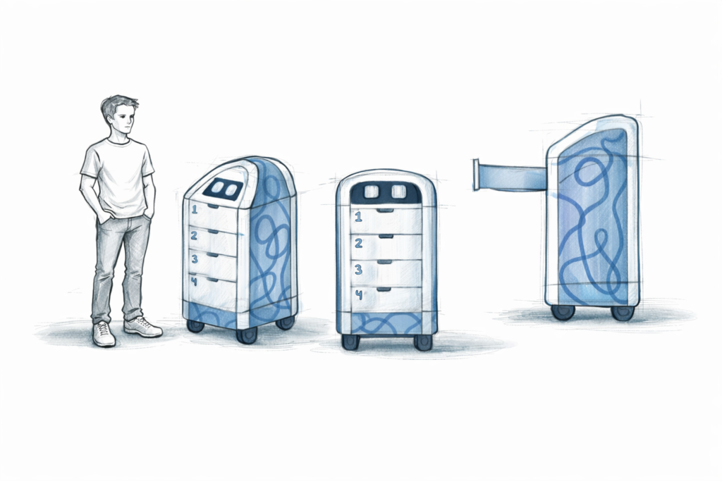
Concept 3
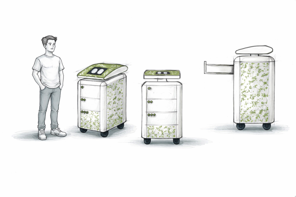
Final design
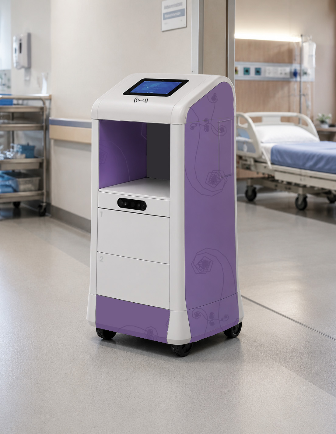
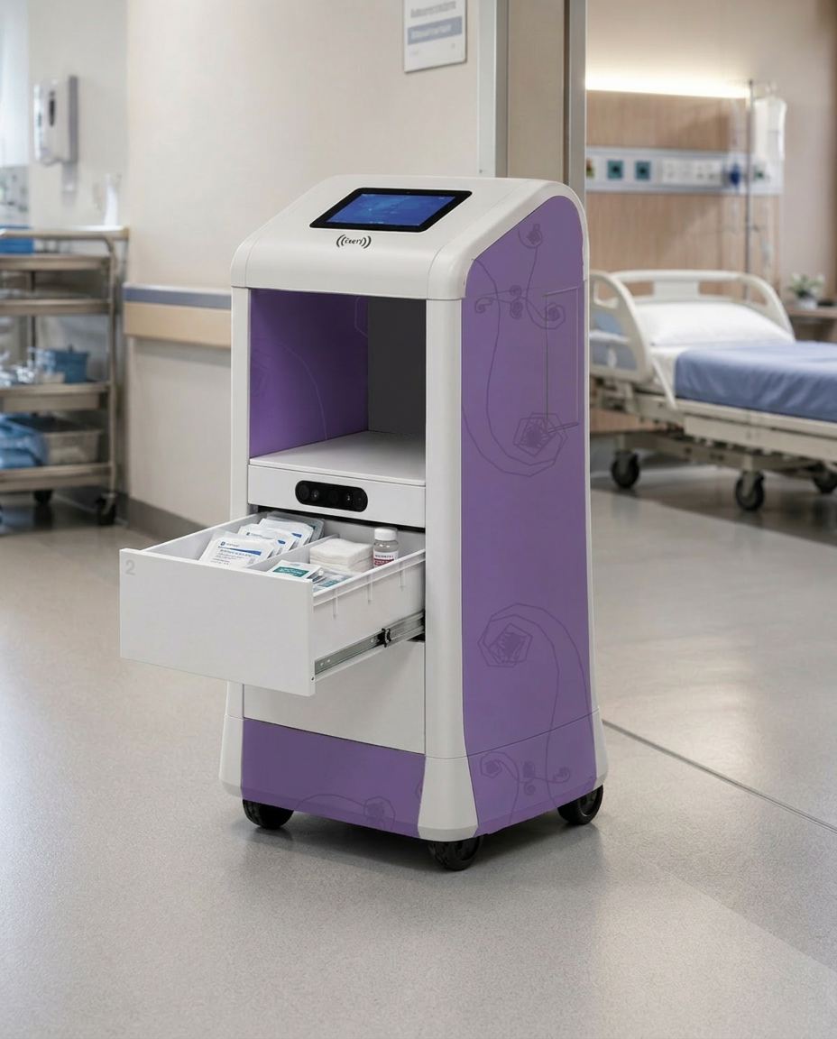
The final concept builds on the highest-scoring base form, extended with space for the MedSafe medication drawer, a future robotic arm, an integrated camera and a screen angled at 30° for a standing user. White stays dominant for hygiene and calm, with a muted accent at the base and sides that can be adapted per department, echoing how scrub and product colours already signal departments across a hospital.
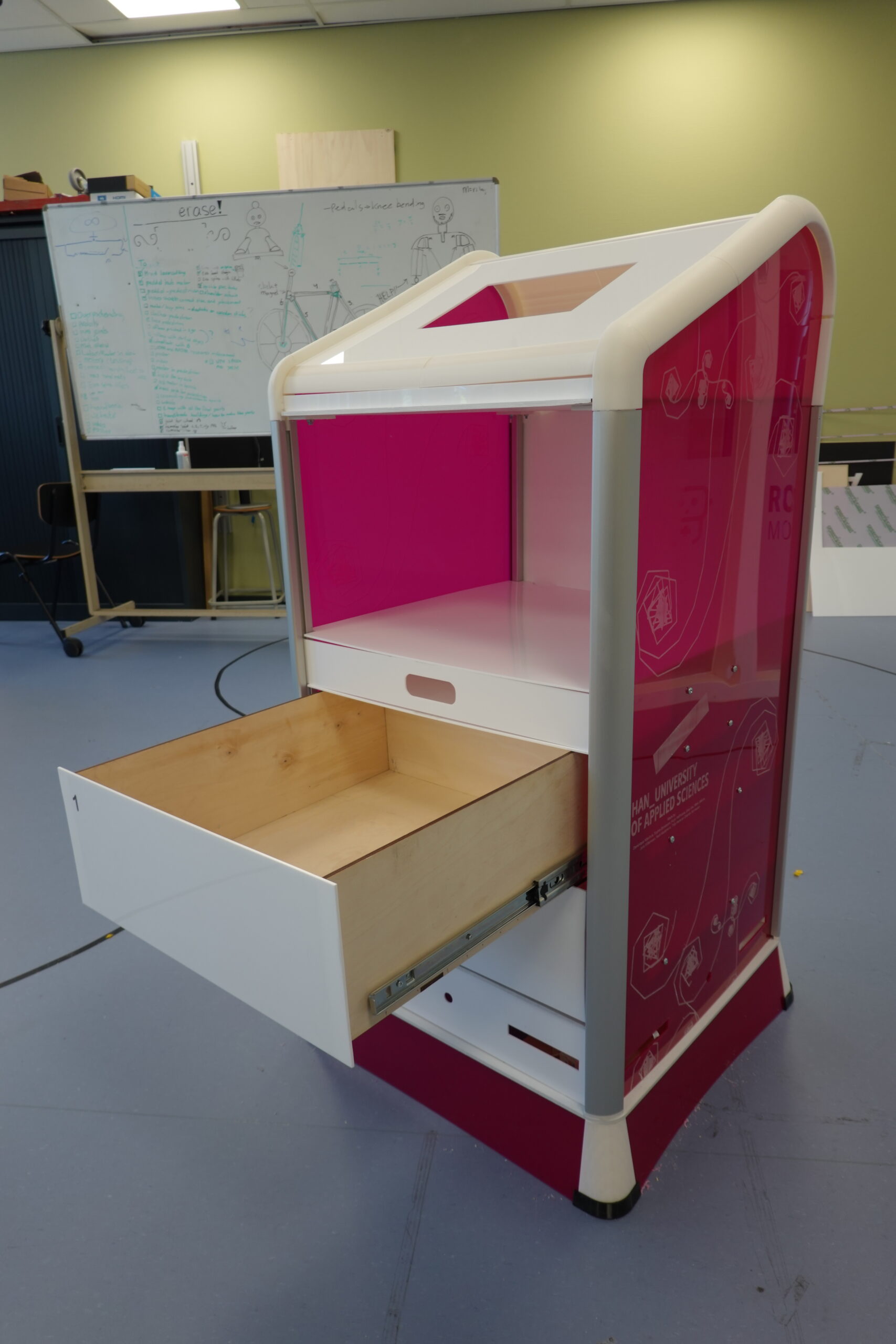
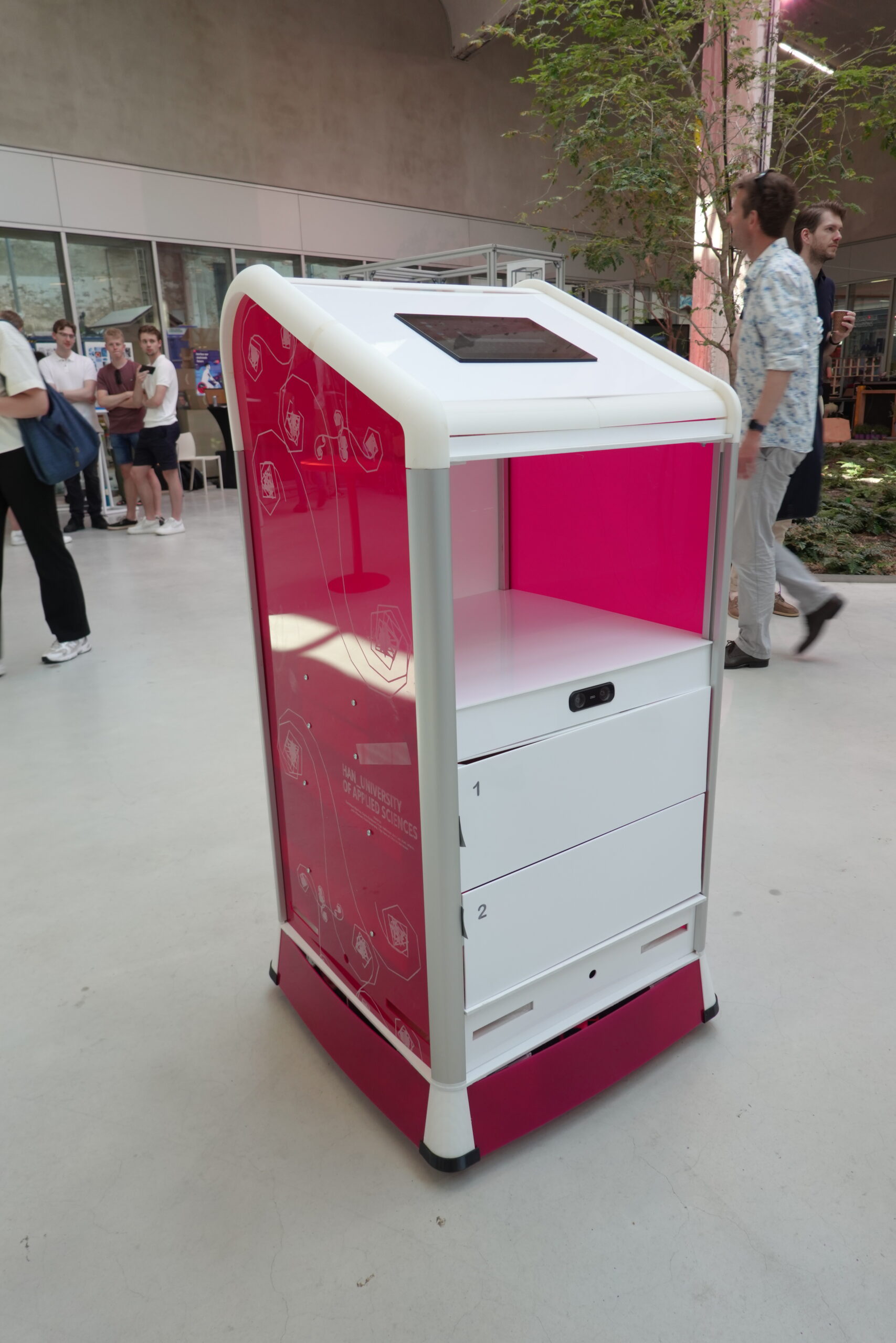
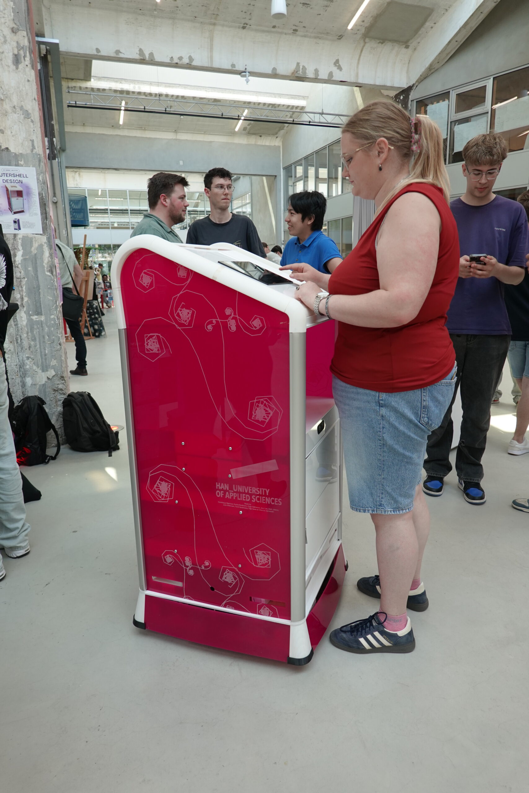
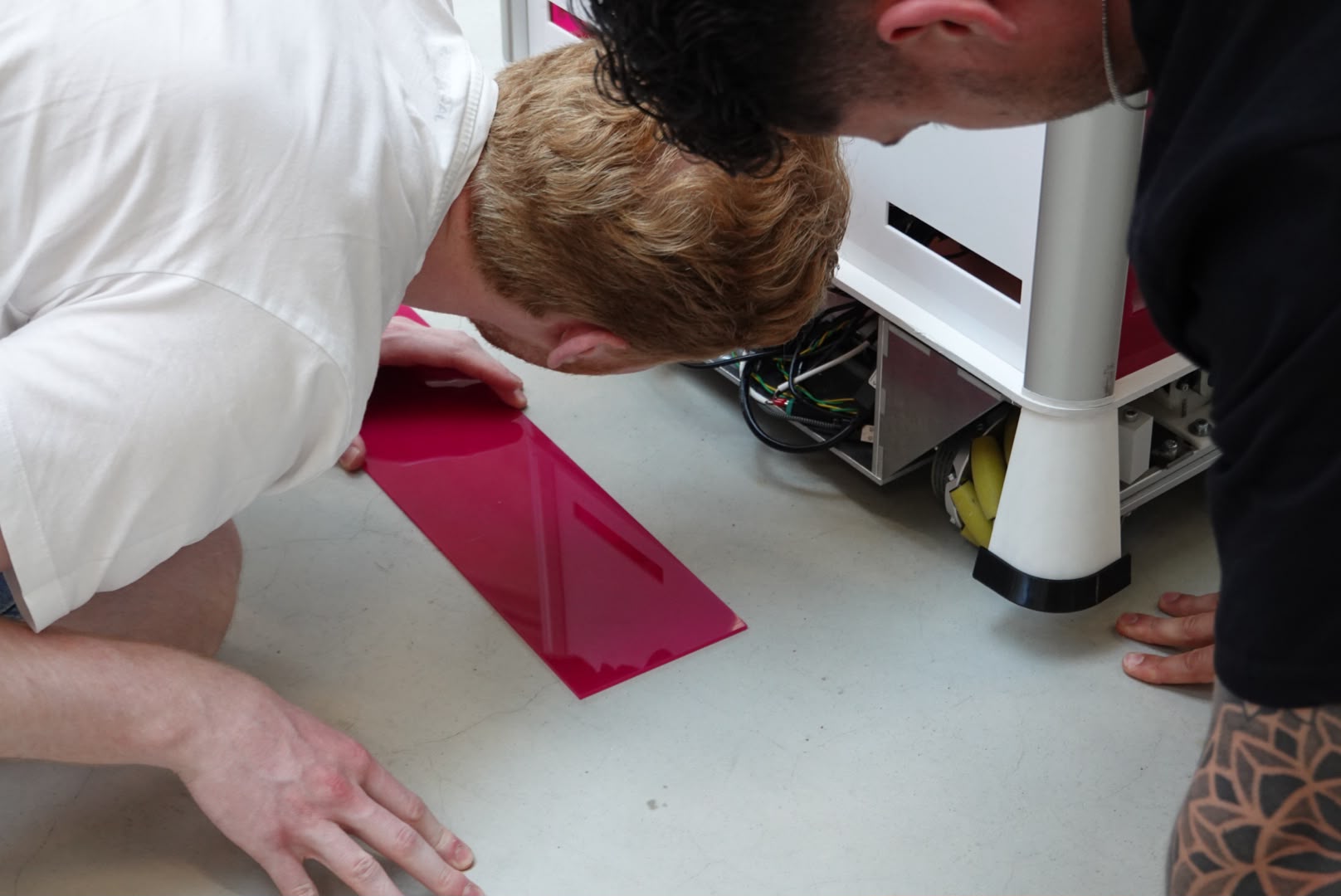
A prototype has been made of the final design to showcase it. The prototype is made to fulfill tasks at the HAN campus, so therefore HAN pink colour was chosen to signal to which department (in this case the campus) it belongs to. The prototype is made with the available materials and production methods that were available and with prototyping and fixing in mind.
Key design decisions
Colour system
A white base keeps the robot reading as calm and hygienic, with a muted accent colour at the bottom for visual stability and side. that can shift per hospital department. The pattern that is shown on the side is one of the result of a slip pattern analysis to show the research that went into the robot
Secure interaction
Drawers are numbered like a printer tray and have no visible handles. Staff unlock them with an NFC card, and a motor opens them the rest of the way. This is to make it easy to use, but also so that not every visitor can just open the drawers.
Form & metaphor
The base form is inspired by a waiter’s hand carrying a tray. A slanted front makes the direction of travel and the interaction zone obvious at a glance.
Validated by testing
A semantic differential test with 8 participants scored this base form highest on friendliness and approachability, confirming it as the direction for the final concept.
Reflection
What's next
It would be good to test the 30° screen angle and NFC drawer unlock with a physical prototype in an actual hospital corridor. Both are grounded in research, but haven’t been tried hands-on yet. A follow-up user test with the full-scale build would show whether the approachability the concept scored on paper holds up in real use.
What I learned
This project showed me how much form, colour and finish can influence how people perceive and trust a product. It made me more aware of how the visual and physical details of a design can shape the experience and expectations around it.